Since websites for restaurant that I have been re-design is really poor on the visualization, here are some of the ideas and inspirations for visual elements that gives more freshness and breath of new air for city deli restaurant that rather look old and dull.


These are all some of the examples that creates food/restaurants website looks appealing and the most important think is very inviting to its customer and more over for the new market.
Supporting Elements
On the home page, it will appear some of the new menu pictures, that are more appealing to the customers. Of course with a new angle which creates an inviting view for those hungry monsters out there!


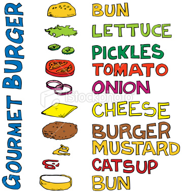
Other pages might be helpful with some new image seen on the above and mixing it with some cheeky illustration that relates to the restaurant itself. For example this 'Gourmet Burger' picture that creating all elements of the burger has a creative mind and inviting those kids on their kids menu choices.
In about us page might be appropriate to tell the customer how they process their food, what kind of ingredients that City Deli uses for their specialties so here below an image of some spices with a minimalist, clean style giving them more confidents on marketing their brand.

And more over to the style itself, City Deli could use these elements that has a strong relationship with food which is knife and forks. Creating a creative elements and modernity to its website.


Colour Palette
Being inspired by restaurants website that I have been mentioned above, colour that has a strong bright which catches the customer's eyes would be suitable for this category.


image credit :
- http://www.etsy.com/listing/86473503/art-for-kitchen-spoon-fork-knife
- http://www.wendymiddleditch.com/2011/12/15/illustration-for-www-taste-buds-me-uk/knife-fork-spoon_redback_v1-3
- http://www.istockphoto.com/stock-illustration-1091560-gourmet-burger-vector-illustration.php
- http://fab.com/inspiration/thai-essentials-kit
- http://www.elllo.org/english/0901/T906-Clare-Fastfood.htm
- http://www.foodportfolio.com/blog/food_photography/natural_food_photography.html

